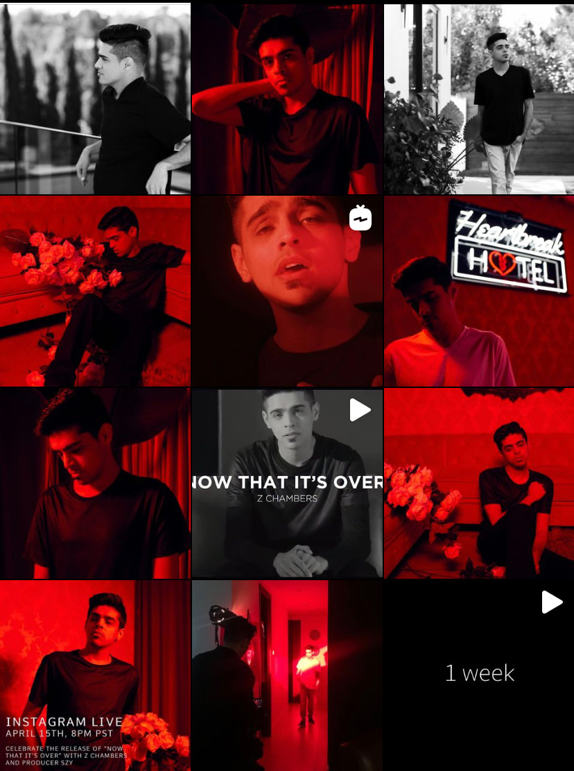
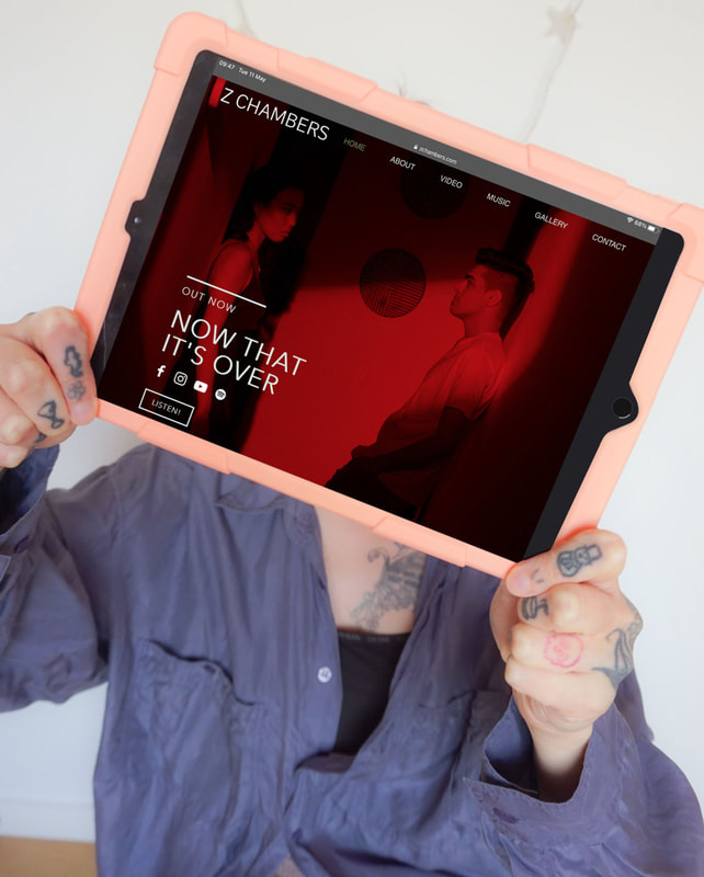
I work with Z Chambers on an ongoing basis to create his overall brand identity as well as creating differentiating visual worlds for each of his 2021 releases. Over time, we have defined who he is an artist, why he's doing this, what he represents, how he will present himself on social media and how we can inspire visuals and aesthetics from his passion for films.
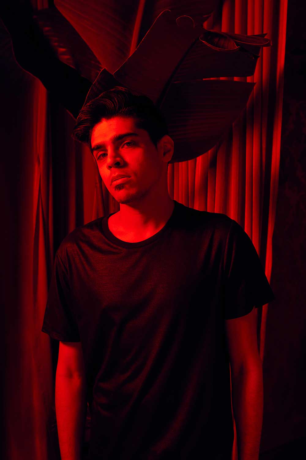
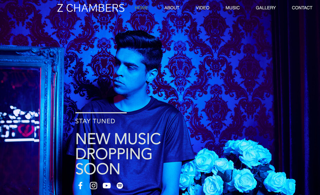
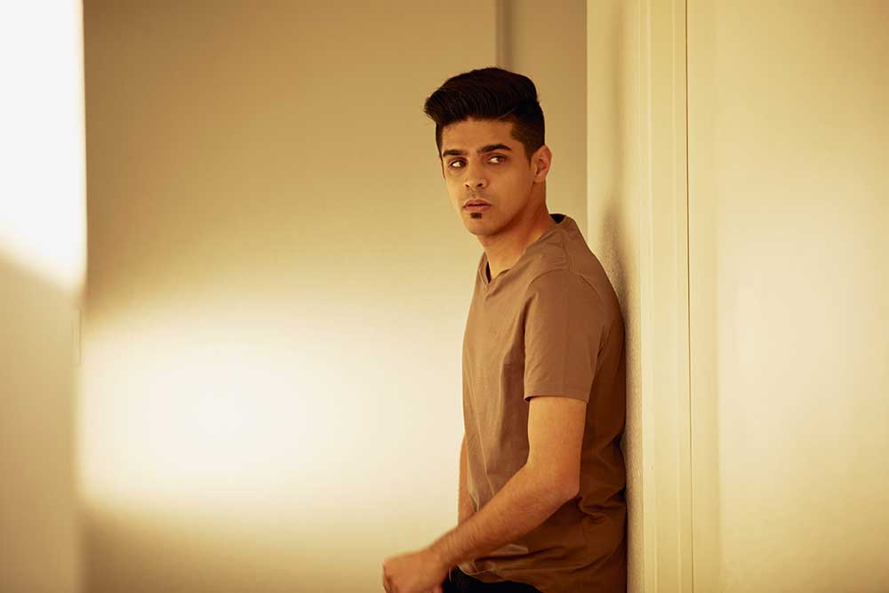
We went super cinematic with fresh and clean block colours, neon lighting and the use of shadows, low lighting and silhouette. Some of his keywords are thought provoking, vibey, clean, slick, moody, sophisticated and cinematic and we're ever evolving and defining his visual brand further through consulting sessions to really dig deep and convey his authentic self to the world!
For each visual world, we took a simple concept of one dominant colour per release which was inspired by The Dark Knight trilogy. From there I added consistent visual elements that represent Z's core brand but both uniquely identify each world whilst keeping them connected.
NTIO visual world
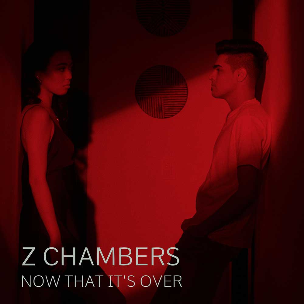
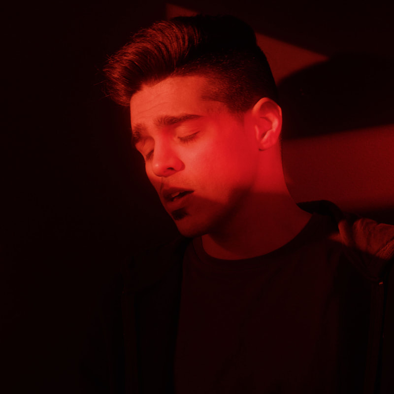
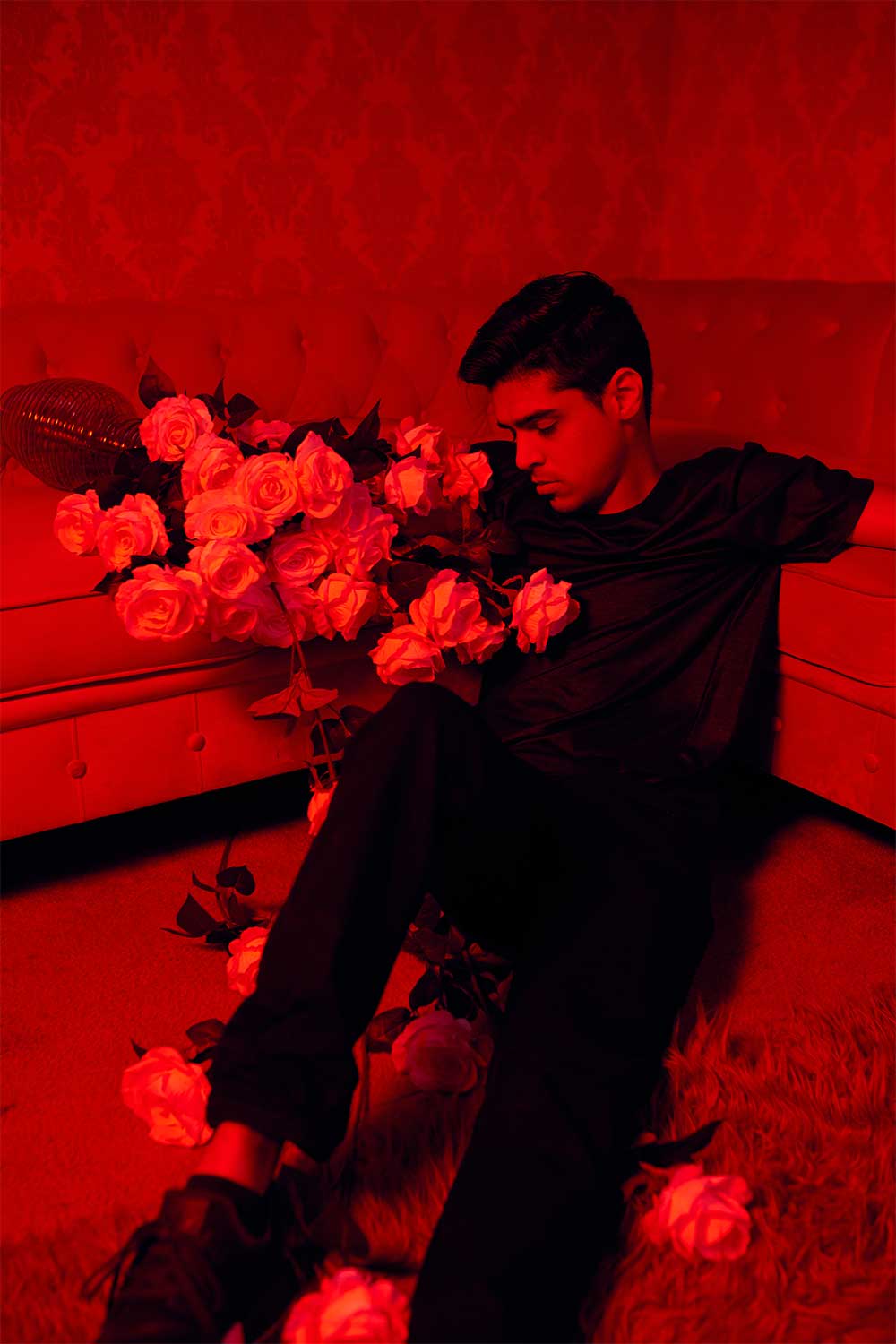
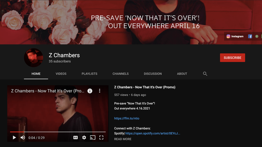
This visual world hit with a bang; neon red, a music video which introduced a glimpse into all three of the upcoming eras and a bangerrr of a tune. Now That It's Over is about a breakup, but feeling glad it's done and looking forward to the future. It involved some happy flashbacks and a peek into where it all went wrong.
Key Stats:
- NTIO music video hit over 53,000 views
Key Stats:
- NTIO music video hit over 53,000 views
Inside Out visual world
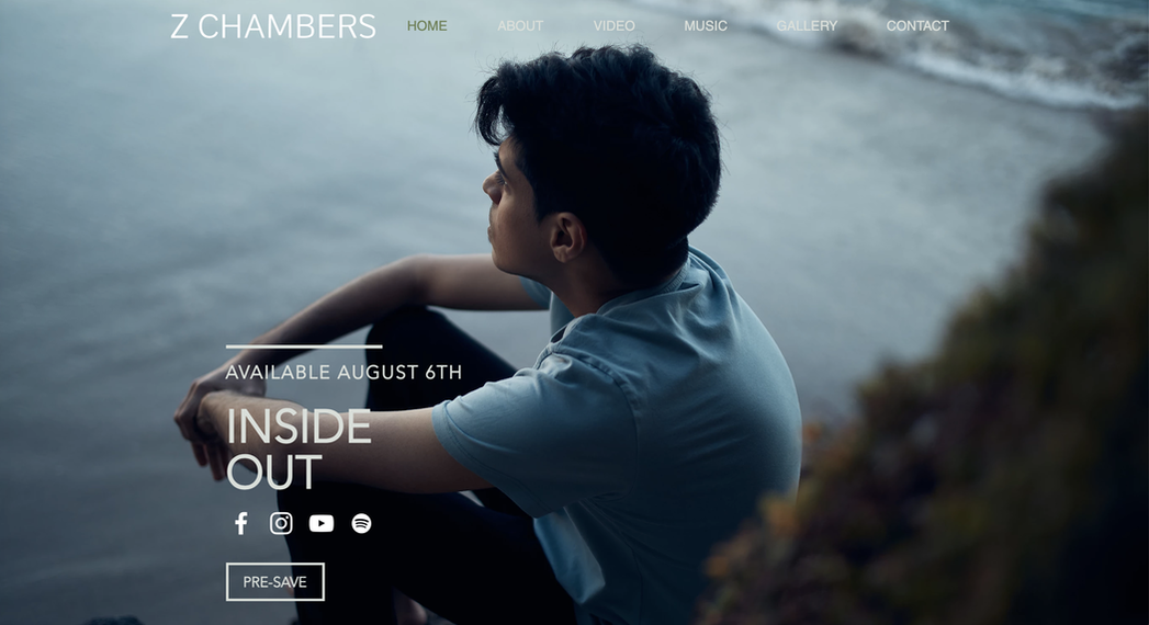
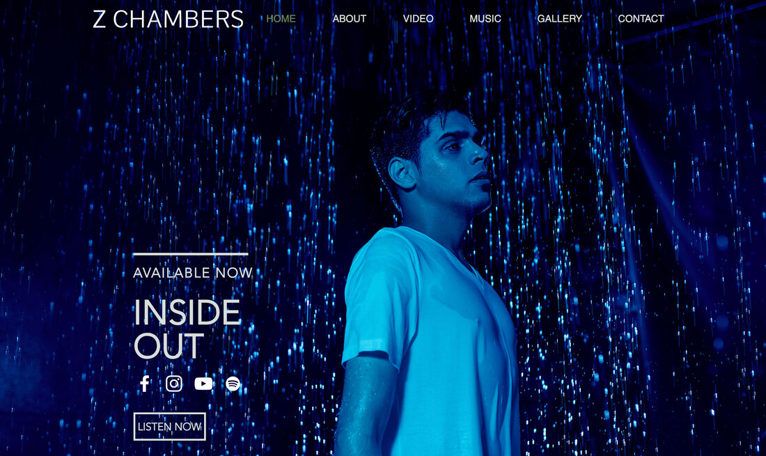
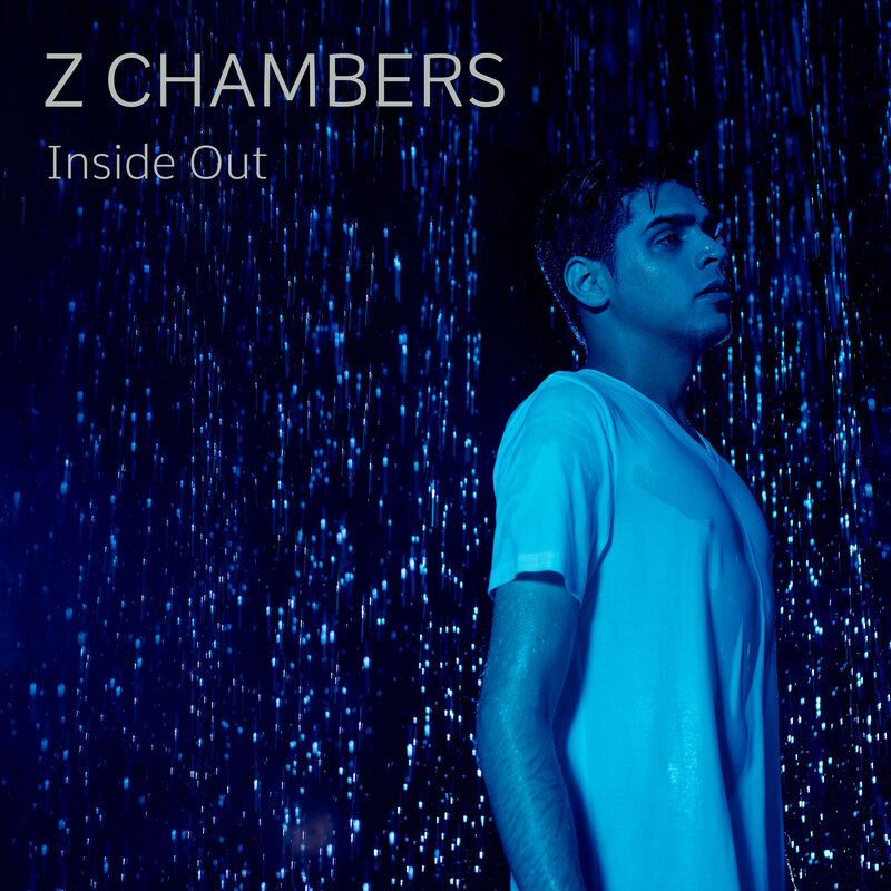
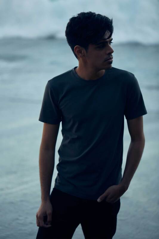
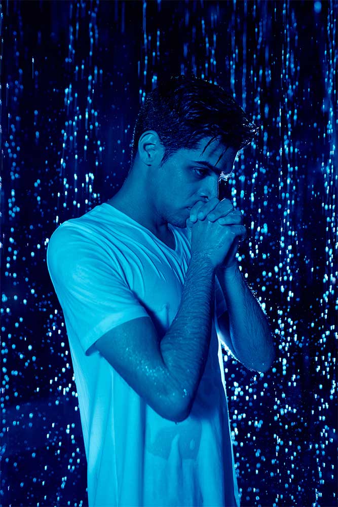
While NTIO was about feeling glad it's in the past, Inside Out is about wishing it wasn't over yet. It brings a deeper, darker vibe with a sense of melancholy. The Heartbreak Hotel sign in red, signifies the transition to this era, followed by a blue version of one of the NTIO images. From here the transition leads on with blue neon lighting but also rain and the ocean, signifying all those tears cried from heartbreak.
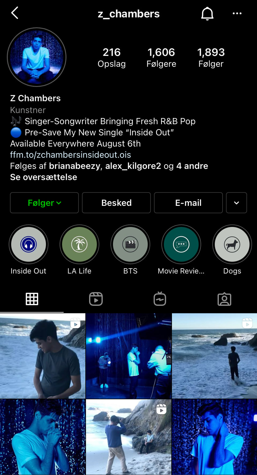
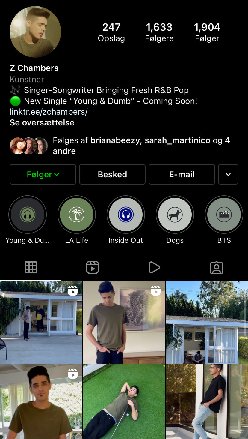
As Z isn't into social media on a personal level, we worked to create content that he enjoyed making and put the emphasis on his influence from movie storytelling to distinguish his personal self with the story around his campaign. I made some blooper reels from his photo shoots as well as some candid shots of the team behind the scenes to get his personality out, allowing him to connect with his audience whilst keeping the content based around his music career. The streams that came from social media were up over 200% for this campaign, with much less ad spend than before.
The beach imagery might be a signal as to where it all leads next...
Key Stats:
- Streams from social media up over 300% from the previous campaign
- Spotify followers increased by over 500%
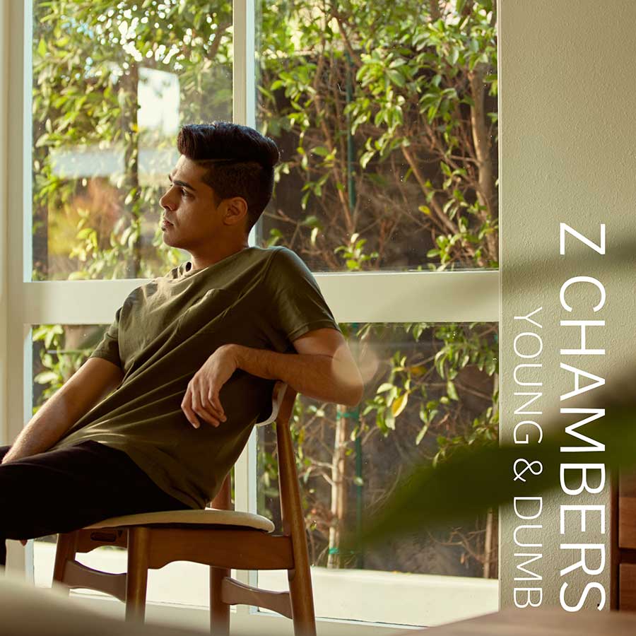
Young & Dumb visual world
Young & Dumb represents the naivety of youth that has passed you by. It's not realising the importance of those times until they're gone.
It's missing the leniency that life grants you in youth. The recurring thought that maybe you didn't handle that phase of your life as well as you could have.
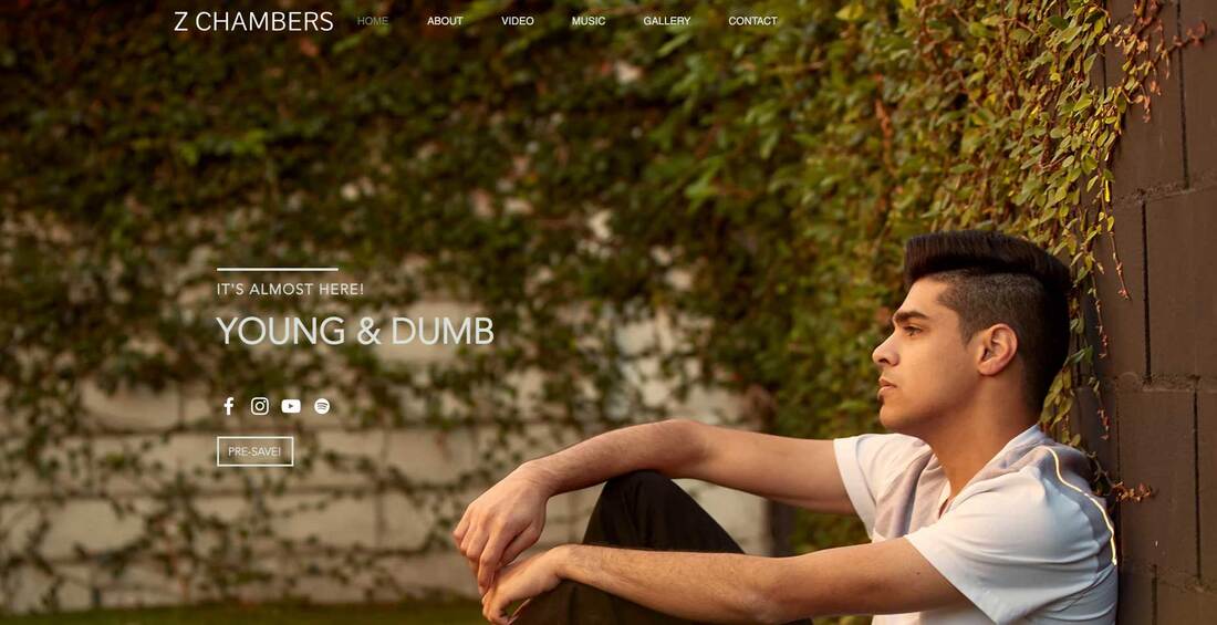
This song was the most personal and relatable to Z, out of the trio. So I stripped it right back and went raw, natural and minimalist to represent that.
The photoshoot was based around reflections and light streaming in through the window panes, to bring to life the feeling of self reflection and the changing of the times overlapping. The house I chose had minimalistic interiors and lots of greenery which complimented the aesthetics we were going for.
We mirrored these ideas with the campaign - keeping it raw, real and bringing back memories of our youth.
photography by Caleb Shane
videography by John Esparza
videography by John Esparza

