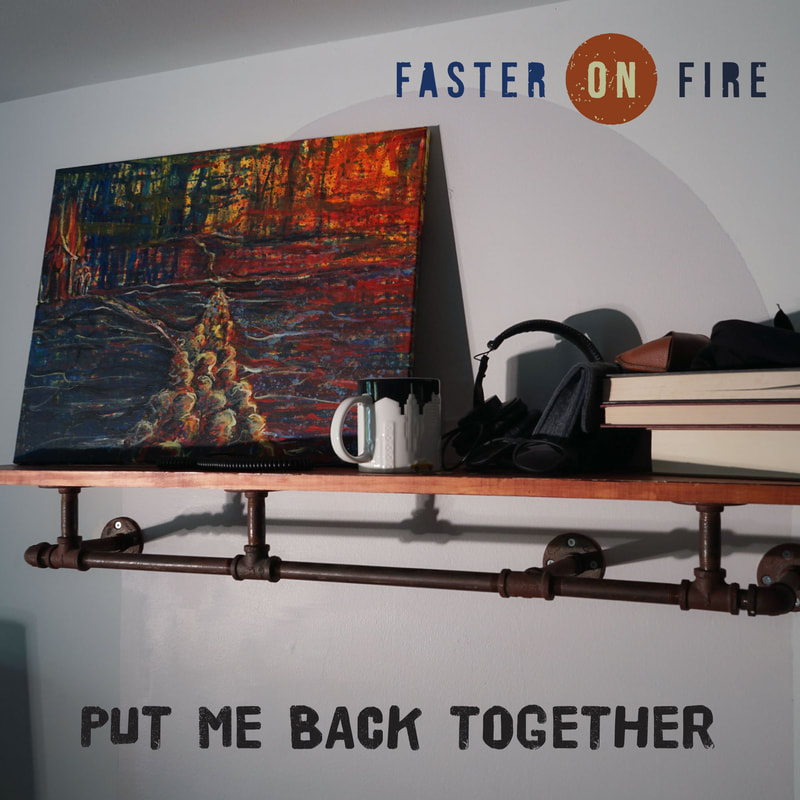
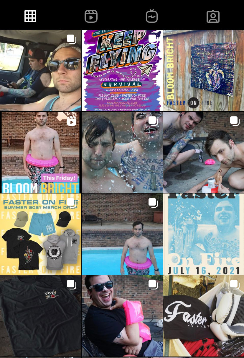
Faster on Fire came to me and meant business from day one! I started by creating an overall visual brand identity; logo, colour palette, font palette and overall aesthetic/ guide for where we were going to take the visuals. Then we went forth with a social media campaign!
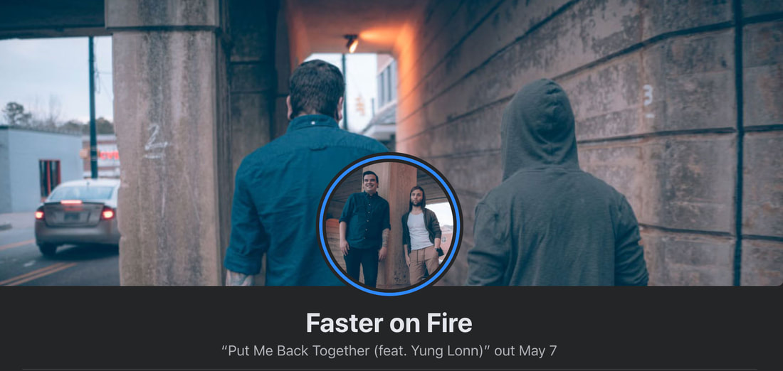
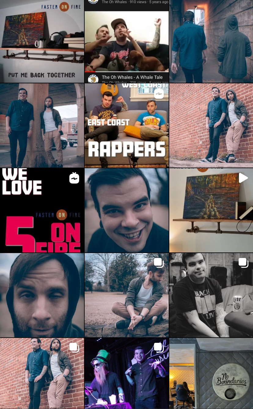
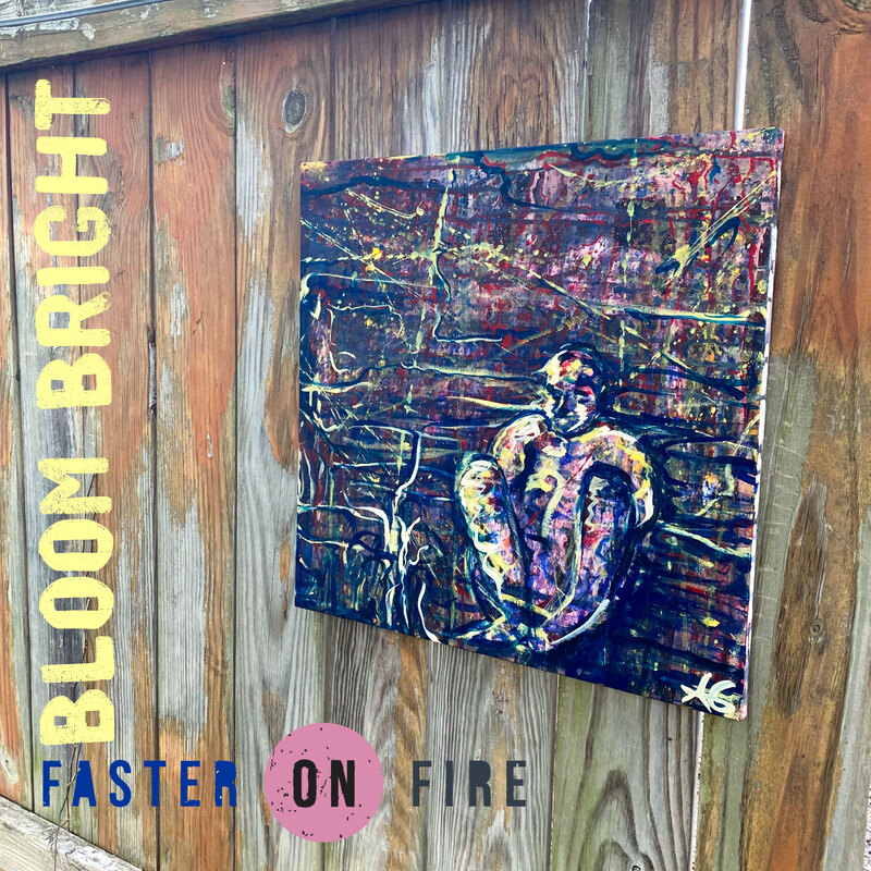
This was their first release so I chose an understated concept; very DIY, getting to know us, the kinda vibe when you turn up to a party and know no one! The introductory stage, if you will. We kept it super raw, with no posed images and I utilised their own skills in photography and painting to help create authentic and raw assets for the campaign.
They nailed the content plan and created the 5 on Fire series which meant they got to chat about their fave artists and influences whilst bringing the fans on for the ride, letting them get to know them more in the process. This series pushed their engagement up 19,000% (!!) and having this between the first two releases kept momentum and pushed the streaming stats up drastically for the second release. Yay!
'put me back together' visual world
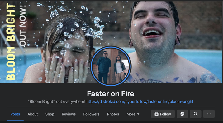
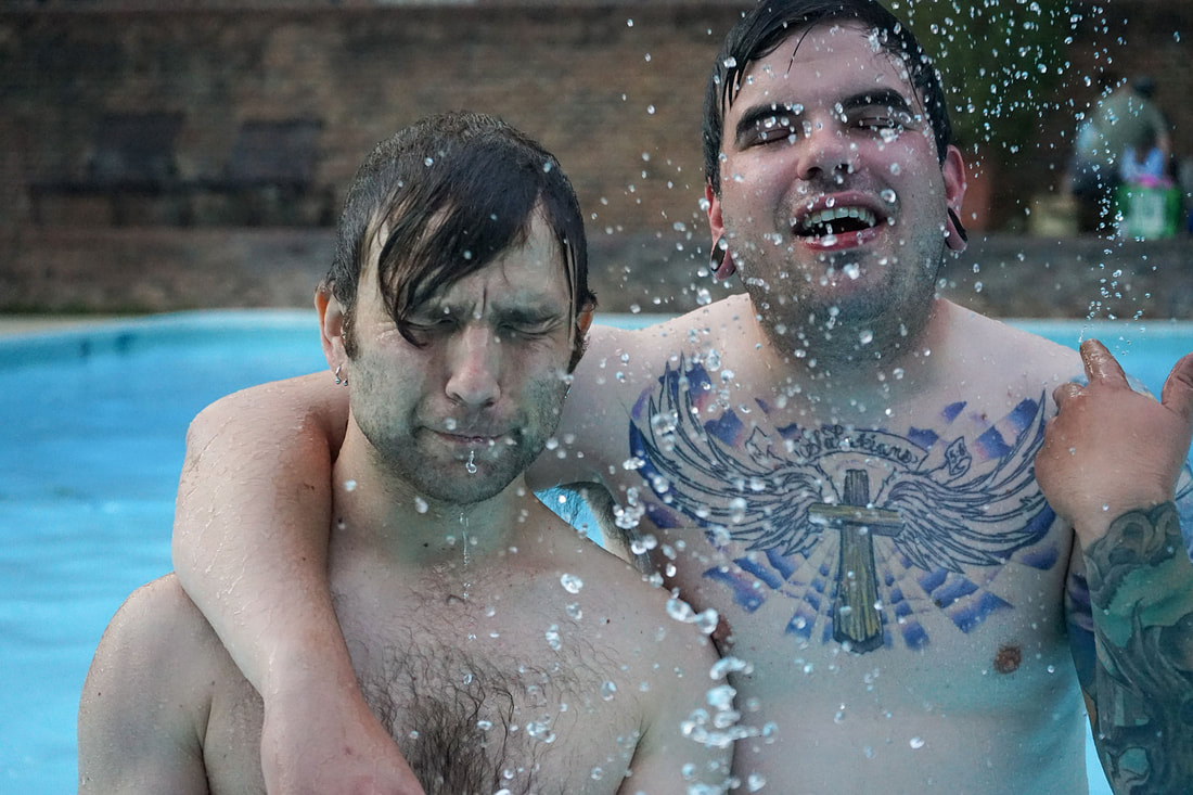
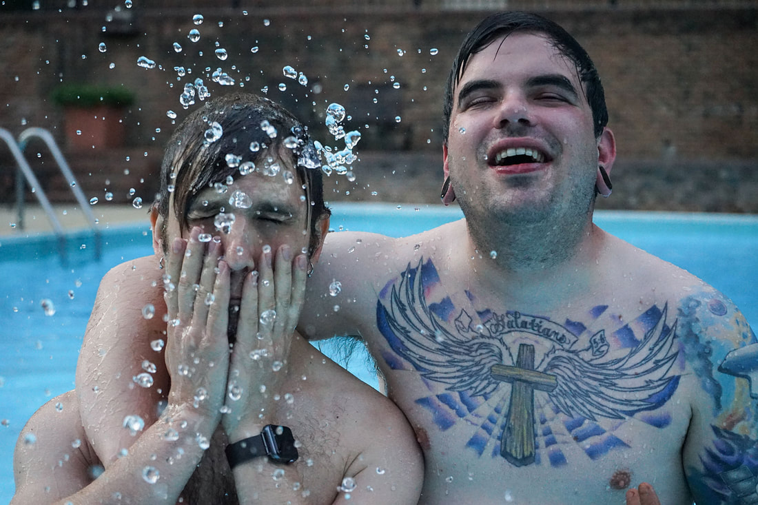
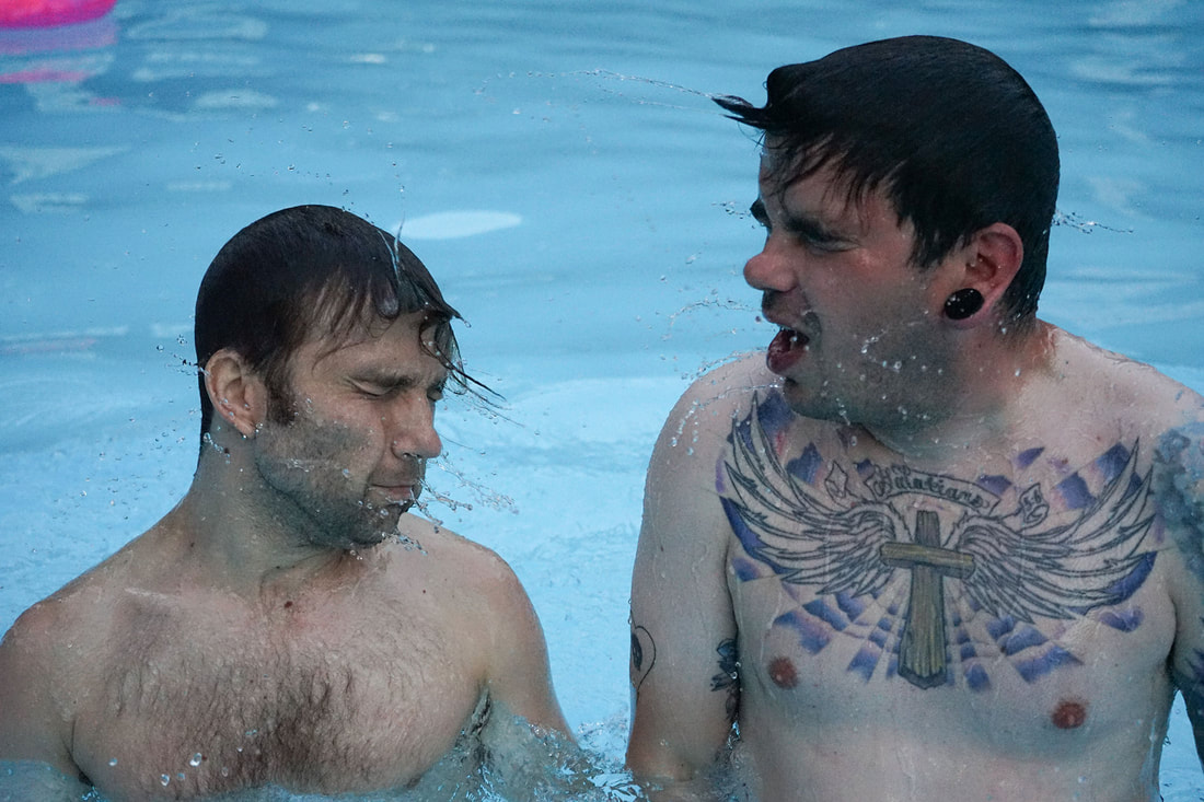
'bloom bright' visual world
The next release Bloom Bright came about in midsummer and for this concept I wanted them to bring their personalities out even more. The previous one had let people get to know them, this one is about letting rip! This stage represented 'mid-party'; absolute chaos, fun and mess!
I kept the cover art's aligned for some brand consistency and to link all the different stages together.


